This blog has been written by Anita Kerwin-Nye, Executive Director of Strategy, Engagement and Commercial at YHA [Alliance member] – an accomplished charity leader, author and expert in education and inclusion.
With every one of my hats on – as lead at Every Child Should, Executive Director at YHA; as parent and as at teacher – I have long been obsessed by signs and ‘stuff’. Leaflets. Books. Posters. Interpretation. Education resources.
What resources do we display and give away at heritage, nature and cultural sites? How do they help (or hinder) access? Can they help support learning? Can they balance affordable with the need to cover their costs and help charitable bodies create sustainable income streams?
For the last 3 years I have been researching this in more depth. As part of work on creating the ideal ‘family friendly’ venues. As part of work on inclusion.
I shared some of the early thinking at the Heritage Alliance’s recent Heritage Day 2022. Considering ‘why’ we use physical stuff and highlighting some examples of things that work.
And as part of this I have been considering what messages do we tell in the signs we display? Do they welcome? Do they educate? Do they excite? Or – even in the best of places – can they accidently exclude?

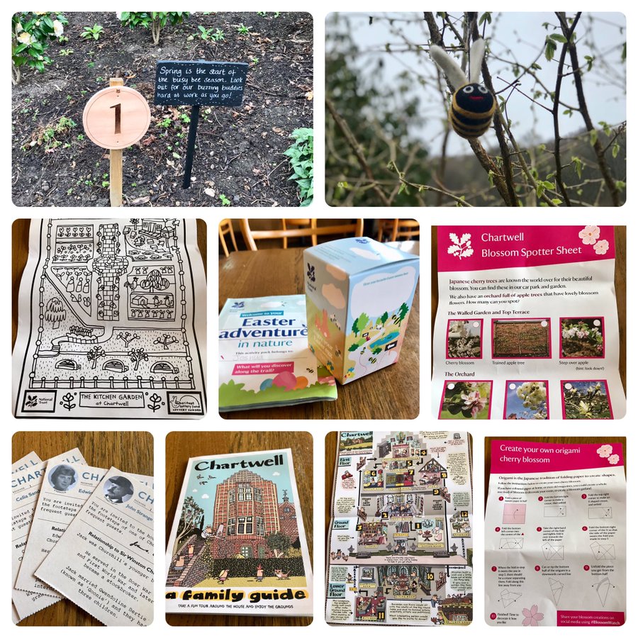
I am not alone in exploring these things. Some wonderful work from Natural England on the images we use. And continuing brilliant work from National Trust – like these resources at Chartwell [pictured above] – supporting families to connect to heritage in new ways.
It is something I am taking into our work at YHA – our Journey Magazine contains resources for children. And I am looking at more widely in my advisory roles on access.
Do send me your best examples of resources that support access and inclusion in heritage and culture, photos of your best (and worst) signs, and more on your successes with ‘stuff.’
